Saturday 12 March 2016

Moodboard #2 (FINAL)


Taking into consideration the feedback i got from my first moodboard, i wanted to adapt it slightly and make it more specific to my final idea.

From the feedback i understood that i should:

- Focus less on tribes, can be seen as moving away from the term 'rebel'
- Look away from rebel groups (fighters)
- Focus more on gay pride
- Offensive language seen as rebellious, rude gestures, slogans etc.
- Use less make up images, and show images that relate to the research and meaning behind your word and ideas.

Taking all of those things into consideration i wanted to create a moodboard that showed how i wanted to portray my final image. I want the message to be about how homosexuals in the past and still in the present day find it hard to express themselves because they are seen as 'not normal to society'. This is how my word 'rebel' is incorporated, the meaning of how homosexuals are seen as being rebellious and not the norm of society for having different views on sexuality and attraction.

I also want the message to be that the 'gay pride society' are rebelling against these views on homosexuality and they are using rude gestures and expressions to show that, and thats how i want my model to pose in my final image.

I see homosexuality as being something that people hide until they feel like they are strong enough to 'come out' and tell everyone how they really feel. Because of this i wanted to show images that represented how everyone should be seen as a blank canvas and however you decide to paint yourself (portray yourself) shapes the type of person you are and the beliefs you have.

From this moodboard i want people to see that for my final shoot i want to incorporate:
- gay pride flag colours
- white (blank canvas)
- rude gestures (middle fingers)
- strong facial expressions
- stripes of multicolour, represents the pride colours


Friday 11 March 2016

Face chart BRAND SHOOT


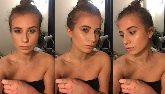
My brand for the inspiration to this shoot was YSL. The product that i was incorporating into the final beauty ad image was 'Touché eclat'. From looking at images of YSL beauty ads i have noticed that the skin is always flawless and the make up is very prestige. As my product was a highlighting product i knew i had to focus on making the highlight stand out in the final photoshoot. So i made sure to keep the rest of the make up flawless and natural so that the eyes of the audience would be attracted straight to the highlight.

As my word was 'rebel' and i also had to incorporate that into my image, so i chose to look at ysl fashion ads for this as they definitely had a sense of 'sex appeal' which is how i wanted to incorporate the word. I wanted to look at the face that when we see someone pose in minimal clothing/naked it is seen as rebellious to society and definitely not the norm. I looked at ysl banned ads and the majority of photos were the model naked or in very very little clothes. So to include the word rebel into my shoot i decided to dress my model in just a black blazer, influenced by the iconic YSL 'Le Smoking' suit and nothing else. I wanted to make the image 'awkward' to look at for some people as this is the first feeling that comes across when looking at images of naked / half naked people.

For the hair i am going to put it into a centre parting and slicked down, low bun so that the hair is very masculine to replicate the design of the blazer jacket.


Products used:
Soap and glory illuminating base
Kryolan foundation palette
Elf foundation palette
Illamasqua setting powder
Chanel 'bronze universal'
MAC 'give me sun' bronzer
MAC soft and gentle (highlight)
Elf eyebrow kit in light
Miss sporty mascara
MAC 'honeylove' lipstick

Tools used:
Zoeva small stippling brush
Zoeva buffing brush
Kryolan stipple brush
Zoeva luxe highlighter brush
Kryolan blush brush
Zoeva angled brush
Maybelline lip brush


Face chart EDITORIAL


My inspiration for this shoot was obviously from the word 'Rebel'. I chose to focus on the point of homosexuals being seen as a difference in society, therefore looking at gay pride. I interpreted the word 'rebel' as showing how in history homosexuals have been seen as being people who go against the 'norms' of society, therefore considered as rebels.

I wanted to keep the face very simple and natural this is why i didn't include any colour. I wanted the face to look just like a regular person. The white represents how effectively we can be seen as a 'blank canvas' and however we paint ourselves creates our personality, appearance, lifestyle, personal preferences..etc. It's all our own choice and we have the ability to change and adapt that. Partly relating that to homosexuals who feel like sometimes they can't be the person they want to be because it's not the 'norm of society' or people around them don't agree with the idea. I wanted the hand to be the colours that represent gay pride to show that i was focusing on this topic. Within my poses of my final images i am getting my model to pull faces as if she is fed up and angry at how society portrays homosexuality sometimes and how they try and silence homosexuals and cover them up.

For the hair i put it in a high,sleek bun so that it could represent both men and women. I also used a white supra colour in the hair using an eyebrow brush, just on the hairline to carry on the effect from the perimeters of the face.

Products used:

Kryolan foundation palette
Elf foundation palette
Illamasqua setting powder
Mac 'give me sun' bronzer
Anastasia contour kit
White supra colour & Illamasqua white skin base 01
Miss sporty mascara
(HANDS) Aqua colours

Tools used:
Real techniques sponge
Eyebrow brush for supra in the hair
Zoeva buffer brush (foundation)
Zoeva luxe highlighter brush (bronzer)
Kryolan stipple brush

Thursday 10 March 2016

Inspo from vogue


'Bright colour is only half a statement. The randomness brings both innocence and boldness to the look.'

I was flicking through an issue of Vogue on the train home one weekend and OBVIOUSLY i looked through the beauty section. I cam across this page which involved products full of bright colours. I instantly thought of my editorial image that i have to think about designing.

Now that i am focusing on Gay Pride it definitely inspired me to think differently about the way i can incorporate bright colours into my design without just doing the obvious. I love the image of the blown out pink colour around the eye. This was seen on Issey Miyake and i just think the way the product has been applied on the face is so different however it looks so much better that just applying a block of colour. It looks like they have almost blown the colour using a straw or hair dryer or something to make the colour spread around the eye creating different consistencies.

Thinking about how i am going to incorporate colour differently into my design, i want to have a practice with supra and aqua colours and also different products to try out consistencies and applying them with other tools to create a variety of effects.